The Clean Air Fund is a newly formed initiative dedicated to tackling the global air pollution crisis. With a launch at the UN Climate Summit on the horizon, they approached Soapbox to build them a brand from the ground up.
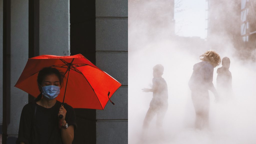
Everyone has the right to breathe clean air. That’s the guiding belief of the Clean Air Fund – a new initiative backed by a group of major philanthropic organisations, including the Children’s Investment Fund Foundation, the Bernard van Leer Foundation and the IKEA Foundation.
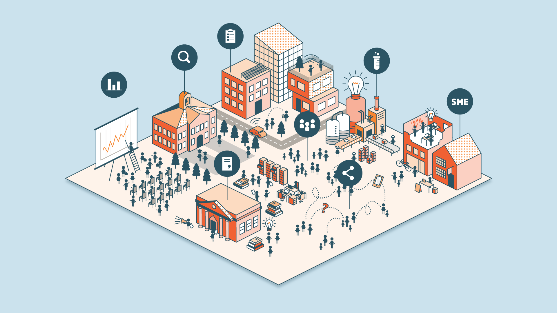
To reach a diverse audience of funders, researchers, policy-makers and campaigners, the Fund came to us in search of a brand strategy and expression that would serve as a statement of intent, and match the scale of their ambitions.
Guided by recurring themes that emerged in interviews and workshops, we created a robust but flexible positioning for the Clean Air Fund that established them as disruptors, determined to take action, catalyse change, and drive real-world impact.
To help provide clarity and direction as the Fund grew, we created a brand toolbox that defined a core story, purpose and personality, along with a set of values for the organisation. We also worked with the Fund to define their key audiences and their personas.
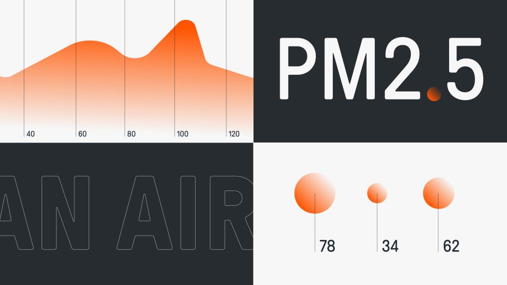
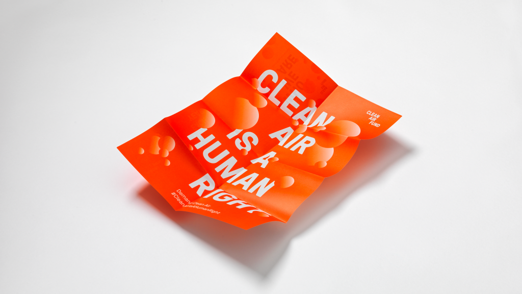
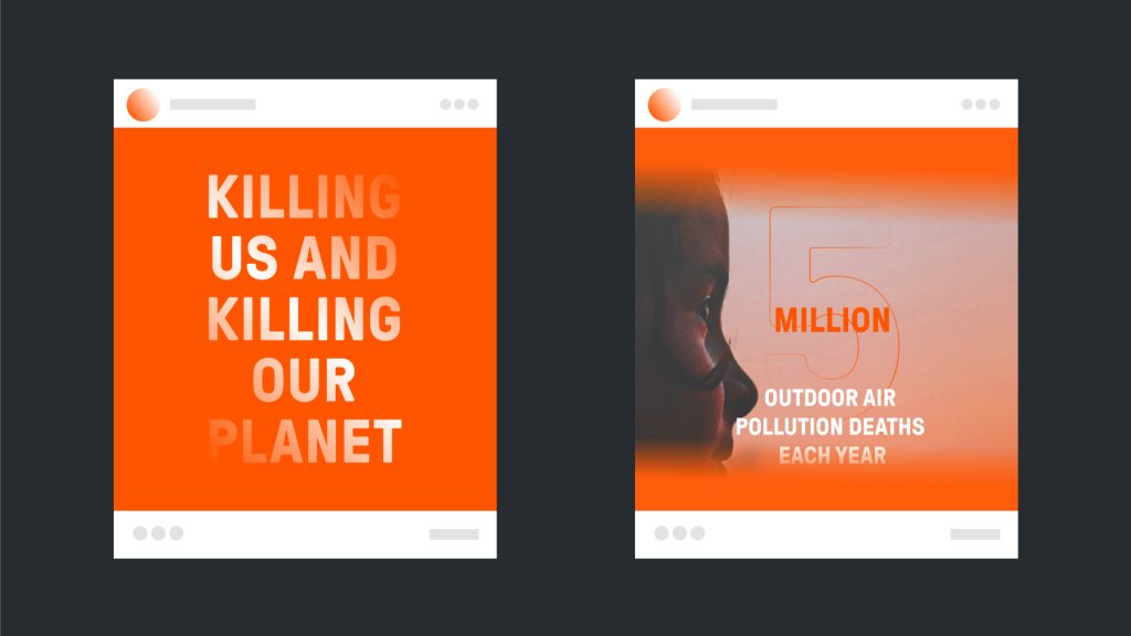
We captured the essence of the strategy, going beyond the usual visual tropes that dominate the territory. We centred the brand system around the role that the Fund plays in making an invisible problem visible, with free-moving oversized particles highlighting the problem in a very clear and immediate way.
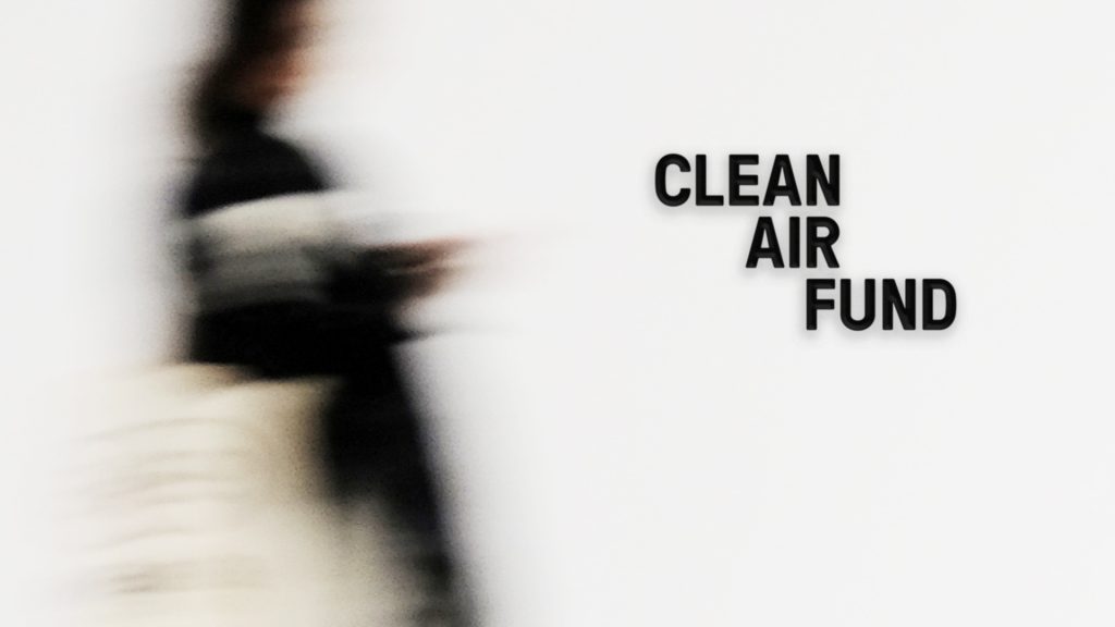
The dynamism of the particles was balanced with the structured and strong logotype, and stripped back typographic approach, allowing the bold call to action language to cut through.
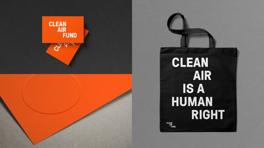
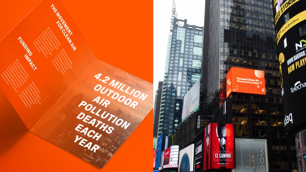
The typographic expression reflects a sense of energy, urgency and authority. Disruptive thinking continues with the bright orange colour palette that sets the Fund apart from its peers .
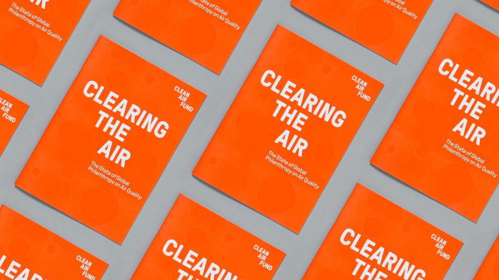
The supporting launch microsite is concise but impactful, with animated particles that bring the graphic language to life. Alongside this, we wrote and produced a series of assets for launch including a brochure, introductory film and social media toolkit.
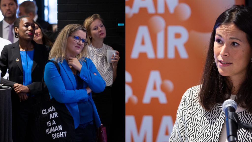
The Fund launched in September 2019 with a programme of activity, including a speech by the Fund’s Director during the UN Climate Summit. We were commissioned to conceive and create a short animation that was displayed on a billboard in New York’s Times Square throughout UN Climate Week, helping take their message to millions.