Although much has changed in the years since the Nuffield Foundation was first established, the original vision of this charitable trust remains the same: to improve social well-being by funding research and innovation in education, justice and welfare. We developed a new brand for them that pays tribute to the past and charts a course for the future.
The Nuffield Foundation was established in 1943, a few months after the Beveridge Report had laid the foundations of the welfare state. Its founding mission – ‘the advancement of social well-being’ – continues to drive their work to this day.
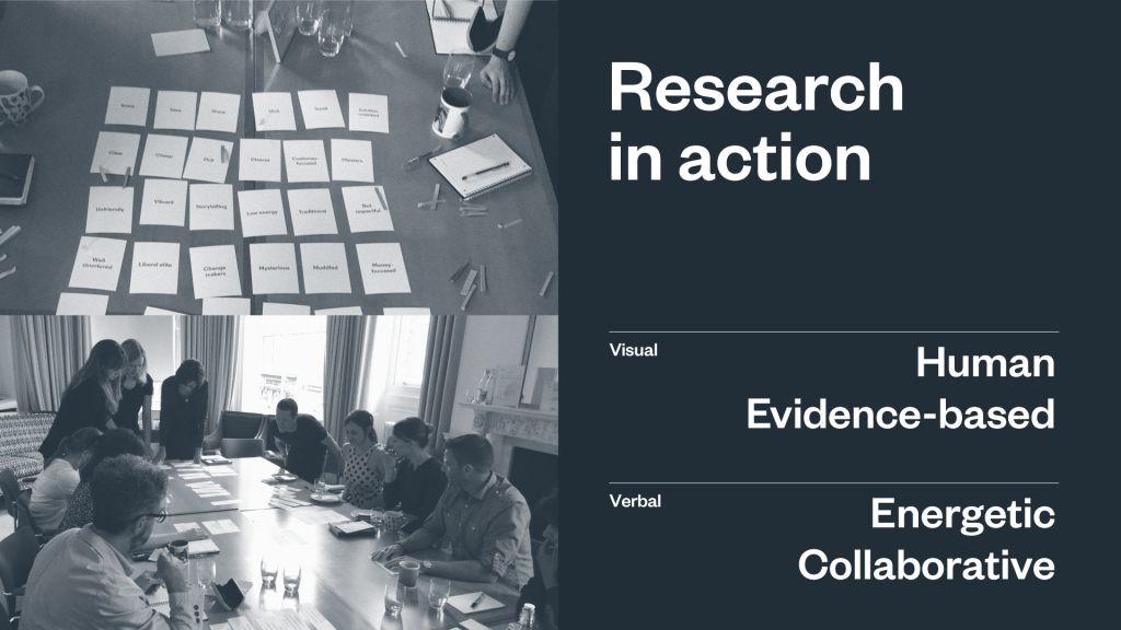
We immersed ourselves in the Foundation’s culture and existing brand, running interviews and workshops to uncover what made the organisation tick. We identified a number of key themes that spanned the Foundation’s activities and would resonate with a range of audiences, distilling them down into one core idea – the power of evidence to change lives.
At the centre of the identity is the ‘N’ frame logo, inspired by the way the Foundation connects individual projects together to give voice to a bigger story and strengthen collective impact. This powerful connecting role became the guiding principle for the development of their new visual identity.
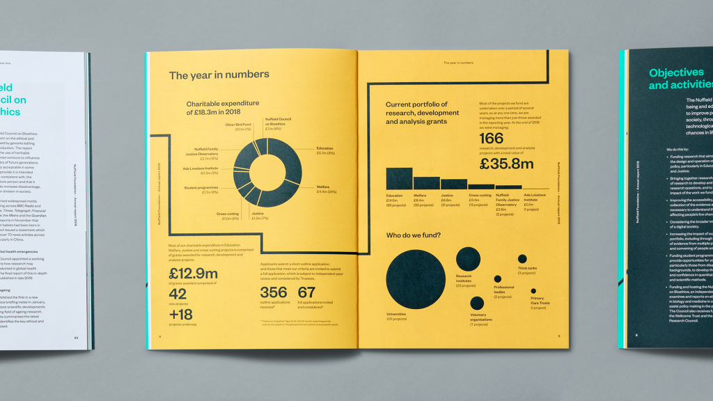
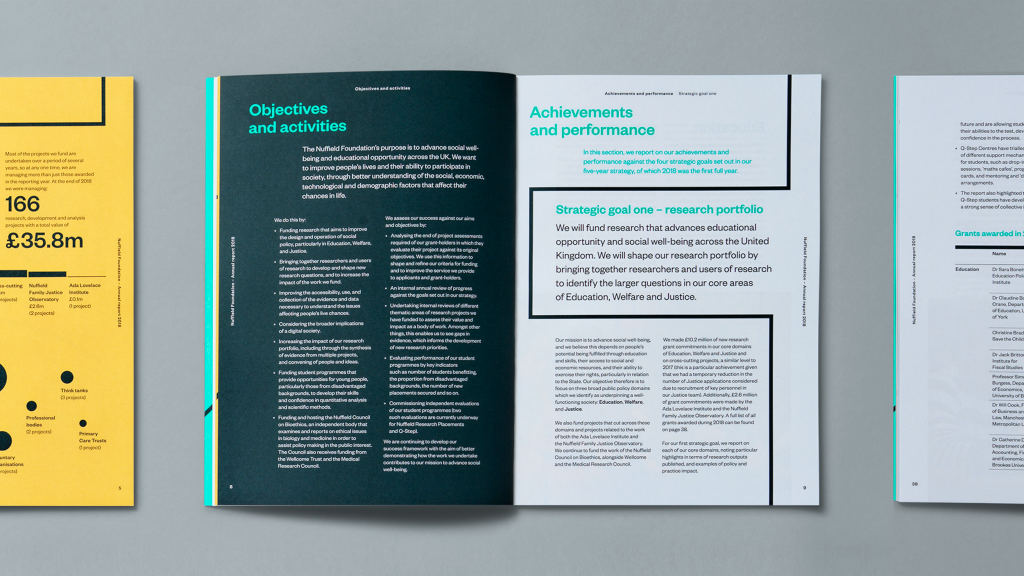
As an ever-changing expression, the frame device signals that the Foundation is open to new ideas and not afraid to experiment. It’s present in the details both big and small, with the same core running through all brand assets, from icons to data visualisations.
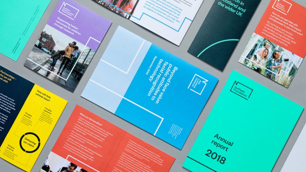
As well as establishing a new positioning for the main organisation, we developed a modern and flexible brand architecture to bring together their range of sub-brands – one that could also serve as a model for future growth.
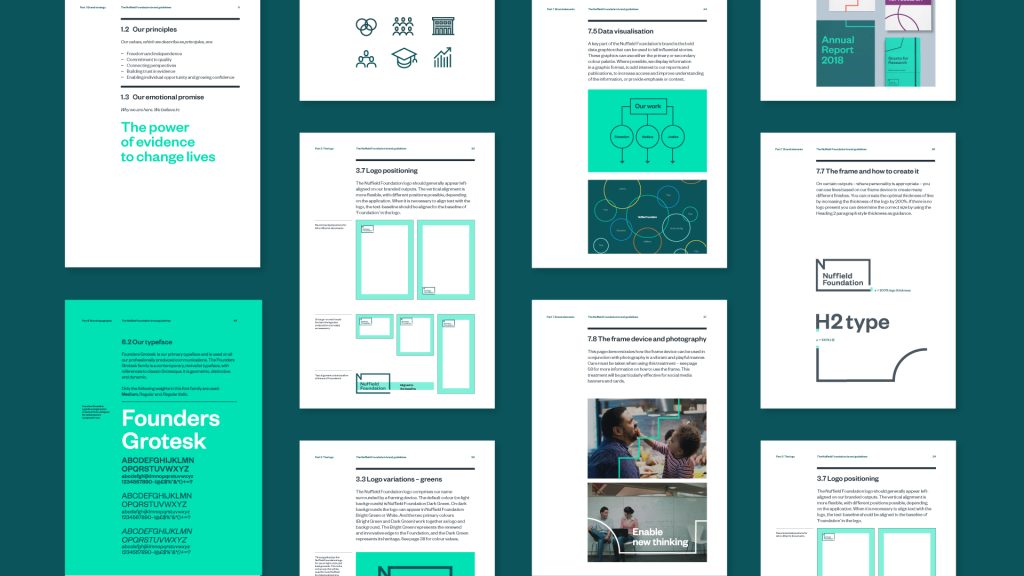
The reimagined colour palette is a nod to the Foundation’s heritage, inspired by the iconic colours of the vehicles produced by Morris Motors (the business established by the Foundation’s creator, Lord Nuffield). The result is a colourful, flexible system that feels approachable and playful, yet rigorous and clear.
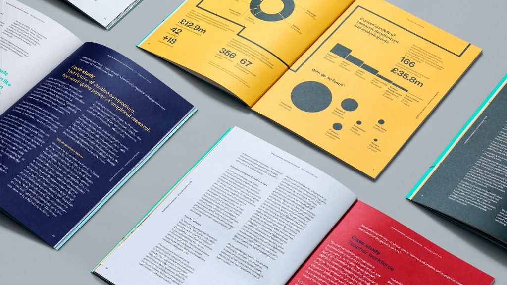
We continue to work with the Foundation as they begin this next chapter, helping bring this living identity to life across all channels and touchpoints, including their flagship Annual Report.