We have all become regular consumers of the visualised statistics generated by the news, scientific publications, magazines and so on. Recently, the Covid-19 pandemic has seen political leaders use data visualisations to illustrate current and predicted situations, to justify their decisions and to influence the public.
This new popularity of data visualisation has also demonstrated that, while the process of turning numbers into pictures has been simplified by data software, complex graphics can easily be misconstrued. To be effectively designed, they require skilled human input. Collaboration helps the designer find ways to communicate the data in a way that makes the audience relate and react to it in a more meaningful way.
Why do people like infographics?
Visualisation works from a human perspective because we respond to and process visual data better than any other type of data. The human brain processes images 60,000 times faster than text, and 90 percent of information transmitted to the brain is visual. Since we are visual by nature, we can use this skill to enhance data processing and organisational effectiveness.
From Thermopylae Sciences and Technology
Data-led visualisations and narrative-led graphics
Data-led visualisations can use standard or bespoke charts. Standard chart types — such as bar, line or pie charts — are preferable where a high volume of information needs to be digested quickly. They are particularly useful where we want to show clear trends or make comparisons between values. We are all familiar with the way they are structured, and our brain can process the content without having to interpret the visual language.
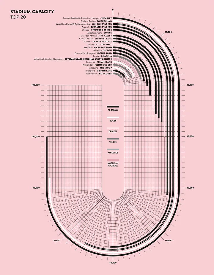
Bespoke charts can be compelling visually and, even though it might take more time to process the content, we are more likely to remember them. In this visualisation for the Centre for London we analysed the capacity of the main London stadiums and translated them to a customised bar chart … in the shape of a stadium.
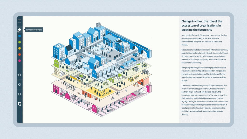
Narrative-led infographics are not based on data, but rather seek to tell stories or describe processes. They often feature illustrations, photographs, or other visual content. In this interactive, multi-layered digital city we designed for the Royal Academy of Engineering, we used an illustrative approach to help city stakeholders navigate and learn about the urban ecosystem, so they can influence positive change in urban developments.
Our process
When designing infographics we follow a clear, streamlined process defined by five steps: briefing, content wrangling, design concepts, roll-out and launch.
During the briefing stage the most important question we ask our clients is: what is the key point (or set of points) you want to communicate? Being clear about your messages is the key to successful infographics. Trying to communicate more than one idea at a time can result in a less powerful message.
We then talk to the client about the intended audiences for the graphic. What kind of people are they trying to reach and what is the response they want to elicit? In what contexts is the graphic likely to be viewed and what previous knowledge of the subject should be assumed? Calibrating the message and visual style around these considerations is crucial.
Next we think about the content: is it data-led or narrative-led? Are the intended key messages self-evident from the information or does it require content wrangling, or editorial help? How will the content be supplied to the designer, and is there any background information of which they should also be aware?
We then need to consider the format and the style. It is important to define as early in the process as possible how the graphics will be shared — will they be printed or only digital? This helps us understand the size and resolution we need to work in. Are there any existing guidelines that we need to follow? Infographics need to be clearly linked to the client’s main brand, so we want to make sure the visual language is consistent in terms of fonts, colours and shapes with other communications.
Once all these elements have been defined we begin to brainstorm ideas. Information design is not all about being rational: what feelings and emotions do we want to evoke in the audience? What is the best way to translate highly technical content into something relatable and easy to understand? We start by creating a series of sketches which, after several rounds of revisions, are turned into the artworked graphics.
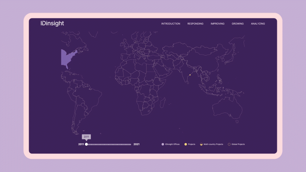
Infographics don’t just live on the printed page: there are a number of approaches that can really help bring a dataset to life. We use interactivity, animations and physical displays to engage our audience and add layers of information that would otherwise make an infographic very complex. In this interactive map for IDInsight, we structured the content in a timeline and divide it into different layers, to turn it into a visual journey of the last 10 years.
We really think that information design is one of the most powerful tools to communicate and spread ideas, especially on social media. Since 2010, we have marked the end of the year with a seasonal infographic. In 2022, we created a set of abstract (but numerically accurate) dynamic visualisations based on key statistics published by our clients over the year. In 2021 we created an animation that shows global warming in the 13 countries where our staff comes from.
From South Asia to Europe to North and South America, our new Landscapes of heat data visualisation shows a steady rise in temperature in all the countries Soapbox staff calls home.
— Soapbox (@designbysoapbox) December 22, 2021
What will we do in 2022 to change this trend? pic.twitter.com/D2clexuwE7
Our five principles:
- Less is more. It is important not to overload a graphic with too much information. If you need to make several linked points, we can create a set of related graphics, which can be used separately or together.
- Structure the hierarchy of information. Use design principles to help guide the eye of the user to the most important part of the design.
- Use colour wisely. Charts with a multitude of colours are hard to decipher, and not just to colourblind readers. Using shades, patterns, labels and highlighting or merging categories are great solutions to reduce the number of different colours.
- Use visual metaphors. Images that can be intuitively interpreted are easier to remember.
- Keep it human. Data can be dry sometimes — adding illustrations and elements of storytelling helps the viewer interpret the information and makes it more relatable.
The term ‘information design’ emerged as a multidisciplinary area of study in the 1970s. Use of the term is said to have started with graphic designers and it was solidified with the publication of the Information Design Journal in 1979. Later, the related International Institute for Information Design (IIID) was set up in 1987 and Information Design Association (IDA) established in 1991. In 1982, Edward Tufte produced a book on information design called The Visual Display of Quantitative Information. [source: Wikipedia]