Complex data visualisations for the IPCC
We ❤️ data visualisations.
We ❤️ them more when they are intended to improve the world that we live in.
From early 2021 to April 2022, we worked with Working Group III of the Intergovernmental Panel on Climate Change (IPCC) on the production of their report: Mitigation of Climate Change. The Summary for Policymakers is perhaps the highest-profile element of the whole report, as it provides an overview of all the key findings and evidence, drawn from the 17 in-depth chapters. There are 9 complex figures in the Summary for Policymakers, each with its own set of authors with whom we worked to make the data come to life.
This particular IPCC report is the third and final contribution to the IPCC’s Sixth Assessment Report. The first two reports review the causes and impacts of climate change, while Working Group III’s contribution focuses on mitigation and the actions needed to slow climate change. It examines how we can reduce emissions of greenhouse gases caused by human activities and provides an update on global climate pledges and emissions goals.
You’ll find the figures we created and designed — in close collaboration with the authors — tucked among the pages of the Summary for Policymakers, and more of our design work in the Technical Summary and report chapters.
While Soapbox has created its fair share of complex data visualisations over the years, this has been one of the more complex data projects we have engaged with.
[Disclaimer: We ❤️ complex data visualisations.]
How did each IPCC figure we co-designed come to be?
Each figure went through five iterations. To start, members of Soapbox’s design and content teams immersed themselves in the IPCC findings to become familiar with the science and content that the figures were intended to communicate.
And then there were questions. Lots of them. Many meetings between our team and the chapter authors took place to define the messaging of each figure and how best to communicate it.
After each meeting our designers produced new sketches that were reviewed and revised over and over again by the chapter authors and delegates from UN member countries. Each figure also needed to pass government approval — a series of conversations over two weeks between government representatives from around the world and the chapter authors.
Working with IPCC’s Working Group III to create the figures for the Mitigation of Climate Change report was particularly interesting because each figure was a delicate balancing act. They had to convey really complex data sets while being simple enough to allow public understanding of the underlying findings. The figures weren’t intended to be policy-prescriptive. Rather they needed to make the evidence clear to policymakers who could make policies accordingly.
Being clear, succinct, and precise while accounting for all of the perspectives coming from the various authors and governments was key. And of course, the designs also needed to follow the overall style of the IPCC brand and meet specific formatting requirements. This may not sound difficult, but when you need to communicate incredibly complex scientific information within only a few centimetres of space, prioritisation and balance are key.
Below are a few of the figures we helped to create for IPCC Working Group III’s report, Mitigation of Climate Change.
See IPCC’s copyright notice on the use of these figures
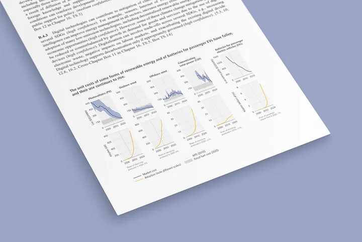
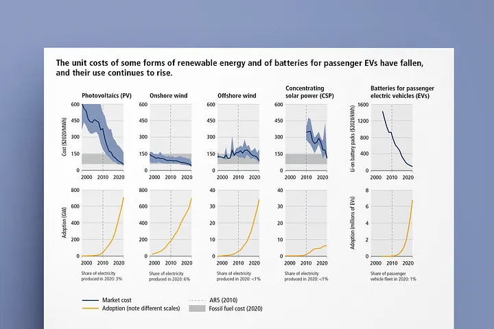
Simple and sleek, these graphs reveal the declining costs of various forms of renewable energy and electric batteries and their rates of adoption.
Charts like these can show that we can afford sustainable forms of energy as we strive to reduce our environmental footprint.
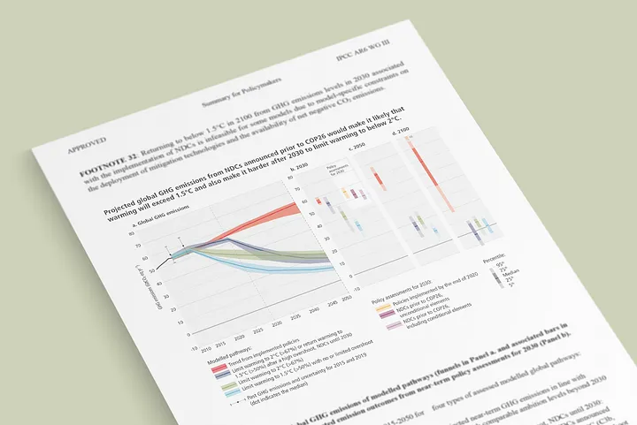
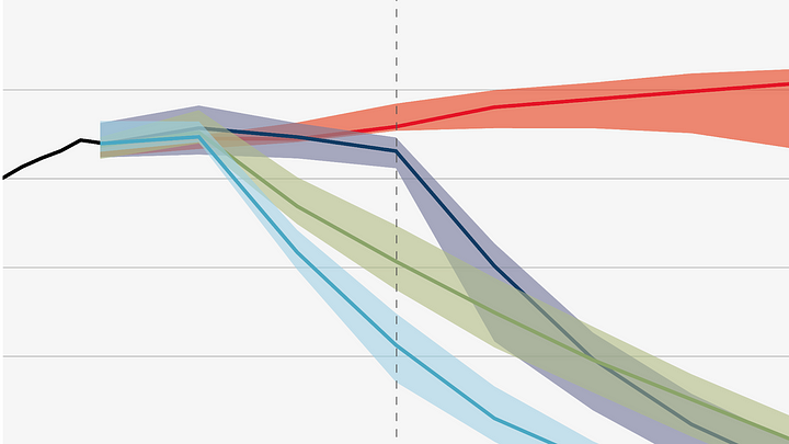
This is a classic IPCC graph, but we made a few improvements using overlapping transparencies to make the different scenarios more evident and put the current trend in bright red to highlight the danger of our present situation. This chart tells us that we are not on track to get to net zero by 2050.
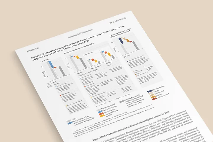
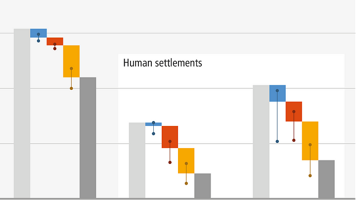
This chart breaks down emissions reductions that are possible on the demand side of the economy–people, firms and governments reducing waste, recycling, driving electric cars, and all the other things we all know we should do. That gets us a long way. But the chart also shows that it doesn’t get us far enough – we also have to reduce emissions on the supply side.
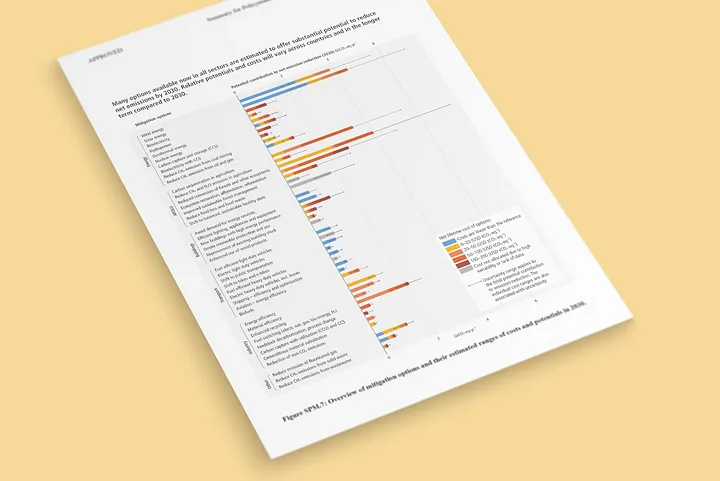
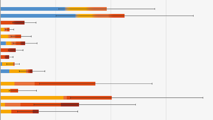
Talking of the supply side, this chart shows us potential ways to reduce emissions there as well. The colours show the cost of various mitigation options arranged into bands. Meanwhile, the length of the bar shows how much we could reduce emissions if we used that option. One of the most interesting things in this chart is that the blue bars represent a cost less than zero. In other words, a lot of mitigation options are actually cheaper than what we are currently doing and they reduce emissions.
For us, complex data visualisations are not just about ‘re-styling’ a graph or a chart. We engage with the data, listen to the authors and what they want to say, and ask the experts the right questions.
At the same time, we are always thinking of the user and how they will receive and interact with the information we want to visualise. We craft, sketch, and revise the structure of how the information is presented to provide the best visual solution to communicate complex data sets.
Not everyone is a climate scientist, so by communicating complex ideas, like we have for IPCC’s 2022 Mitigation of Climate Change report, we hope to make data and evidence more accessible in order to communicate the urgency of things that really matter.