The Institute for Fiscal Studies (IFS) is a byword for rigorous, impactful and fiercely independent policy analysis. When they wanted to overhaul their visual identity and online presence they turned to Soapbox and our unrivalled experience in the think tank sector.
The IFS is one of the world’s most respected social science institutions, combining independent and rigorous research, with an inclusive outlook and high public profile. For over 50 years they have analysed and informed economic and social policy decisions, helping policymakers understand the impact that their choices will have on individuals, households and businesses.

Our work on the new IFS website was actually the culmination of several smaller projects. We had designed and developed the IFS ‘Inequalities’ microsite in 2021 (read the case study). That process led IFS and Soapbox to reconsider some important visual elements of their brand. The result was a refreshed identity system with a new approach to colour, typography, photography and charts, as well as an updated version of the IFS logo.
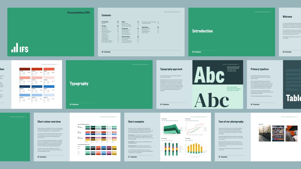
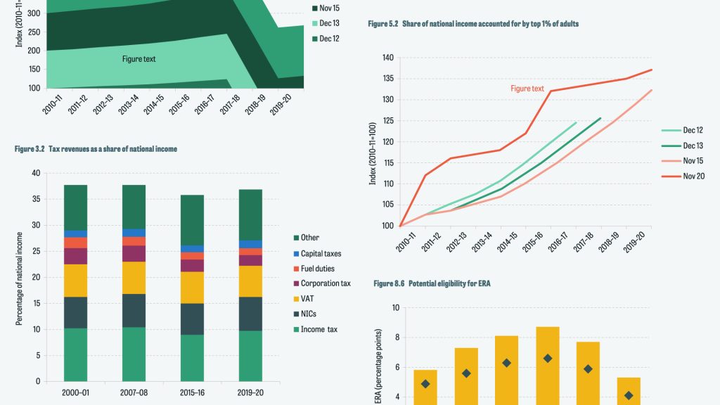
The next step was to roll out the branding for day-to-day use. We supplied a set of brand guidelines and other material, but perhaps even more important were the new Microsoft Office templates. For most IFS staff and stakeholders, most of the time, the visual side of the brand is experienced through Word and PowerPoint. We built a set of detailed, consistent, on-brand and user-friendly templates that could be used across the institute.

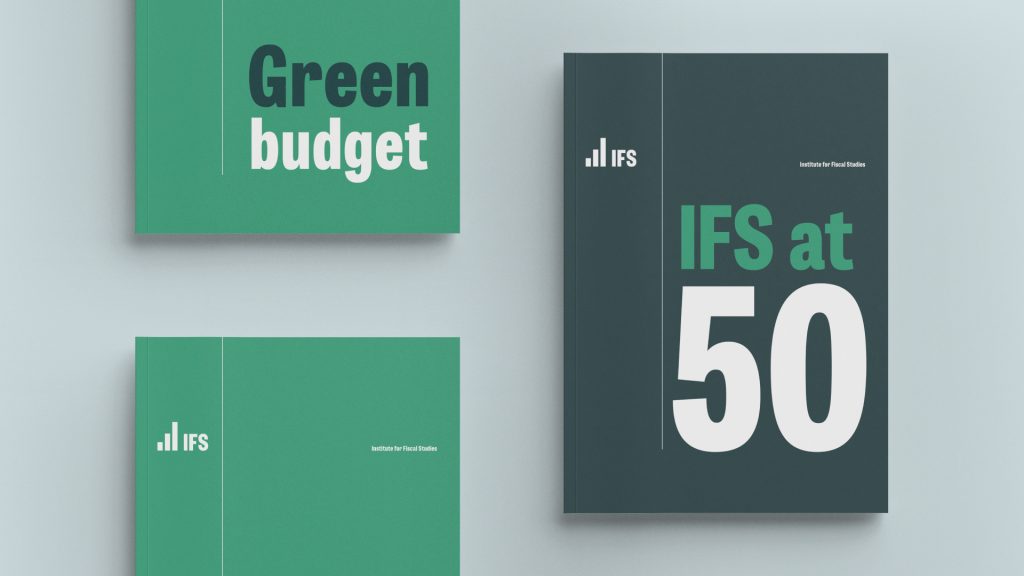
We then showed how this branding could be used in IFS’s sub-brands. We designed and developed the Taxlab microsite as a public-facing explainer of the complex world of tax. The site beautifully showcased the updated brand and included some truly unique functionality for sharing data visualisations on social media.

The main IFS website came next – the largest IFS project by far. The existing website had become unwieldy over the years, with an extremely large volume of content, and a lot of ‘nested’ content types, making navigation and search very difficult.
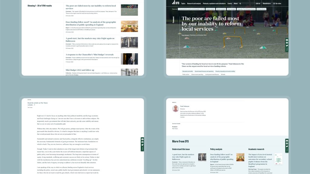
A complete reworking of the information architecture was needed. Following stakeholder research and an extensive discovery phase, we built a two-level structure: a small number of broad, familiar topics; and a much larger number of cross-cutting ‘tags’.
This content structure avoids complex parent–child relationships between topics. It also improves user journeys and time spent on the website, partly because it allows for much more granular and relevant related content to be served to the user.
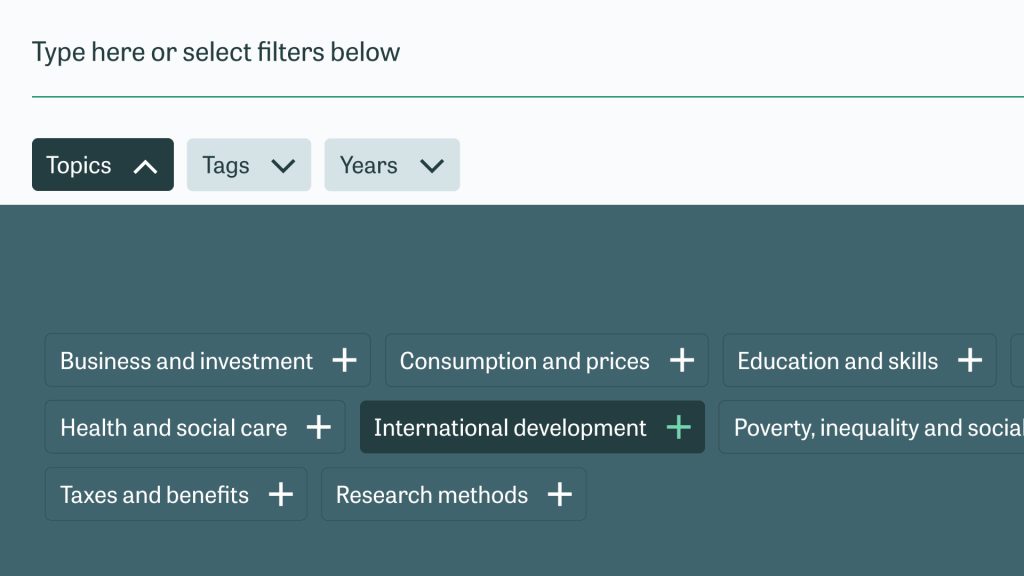
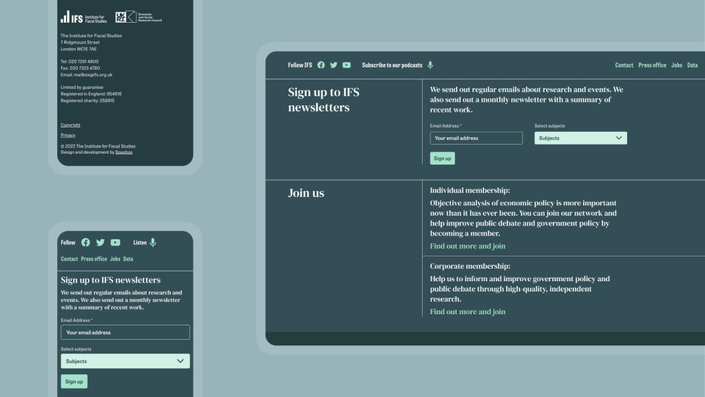
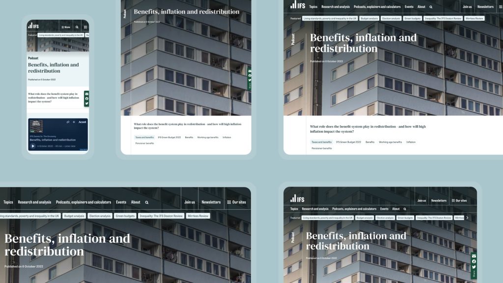
The site architecture informed the navigation, UX and design, so that IFS’s three key audiences – those involved in research, policy, and the general public – are each able to quickly see or be guided along the correct path to relevant items.
The website also gives IFS the ability to produce their own microsites, with no additional coding or development. These are a useful way of keeping project-specific information together while allowing for future growth. The first launch to use this tool was the Education Spending site, with more to follow.

The IFS is a national and international authority on economics research, policy and public understanding. They now have a website and brand that help them to share their outstanding work with their diverse audiences, and remain a compelling voice in economics debates for the future.