A new brand and digital presence to recharge Britain’s leading social research institution.
Impactful, rigorous and respected, the National Centre for Social Research (NatCen) has been revealing the reality of people’s lives and society for over 50 years. Through robust research on current and developing questions, NatCen’s work uncovers what people really think about important social issues and how Britain is run.
NatCen has always been a pioneer in social research. With a new organisational strategy that sought to cement their role as the National Centre for Social Research, NatCen were ready to take up their rightful place alongside other great British postwar institutions – the National Theatre, the Open University, and others. To make this happen, NatCen needed to update their brand and digital presence to align with their role and standing in the sector.
We engaged with stakeholders and audiences and immersed ourselves in NatCen’s work and history. This revealed a thoughtful and fiercely independent organisation; one that helps decision-makers to better understand the public and helps the public to understand themselves.
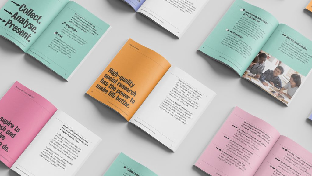
We captured this in an updated brand strategy for the organisation, introducing a powerful positioning and personality that reflected a more confident NatCen. Building on this new strategy, we updated NatCen’s existing visual identity, reworking its main elements to create a sharper, bolder and more flexible expression of NatCen’s brand.
NatCen works at the intersection of data and society, so the identity needed to be able to depict facts and statistics with bold clarity, as well as represent a broad spectrum of life.
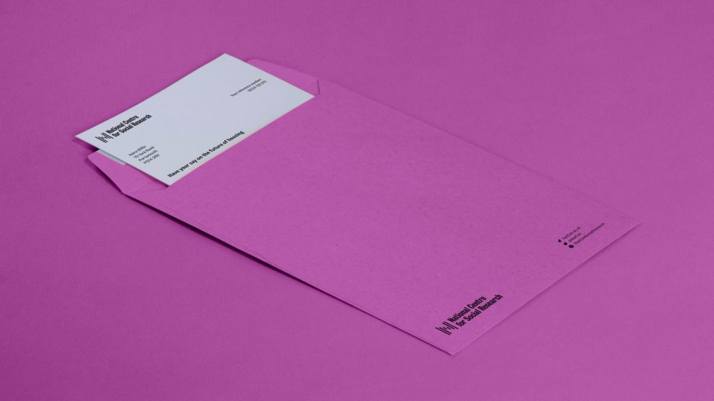
At the heart of NatCen’s new visual identity is the logo. The symbol forms an ‘N’, using data bars in motion, and the logo system allows for the Scottish Centre to have its own custom ‘S’ to stand proudly behind.
Typography plays an essential role in NatCen’s communications, but their old typeface, Helvetica Condensed, lacked a connection to the brand. We wanted to draw a link to ‘Britishness’ and more precisely the history of public communications. We selected Bureau Grotesque to lead the way, described by TypeNetwork as “the essence of tooth and character in an English 19th-century sans”. Colophon’s Fann Grotesque, which “draw[s] inspiration from a number of British type foundries”, plays a supporting role.
No single colour could hope to represent society as a whole. So we proposed a broad palette of five vibrant colours, each with their percentage tints, that could be flexibly applied depending on the output. The brand guidelines we produced gave details on colours, colour pairings and typography, for easy application and consistency throughout all materials.
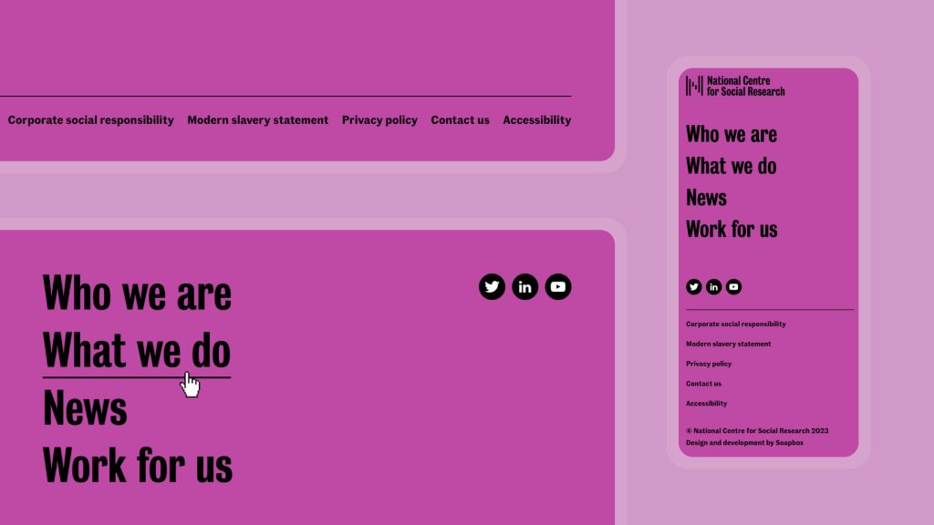
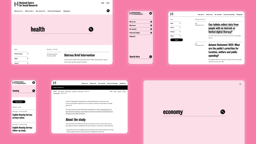
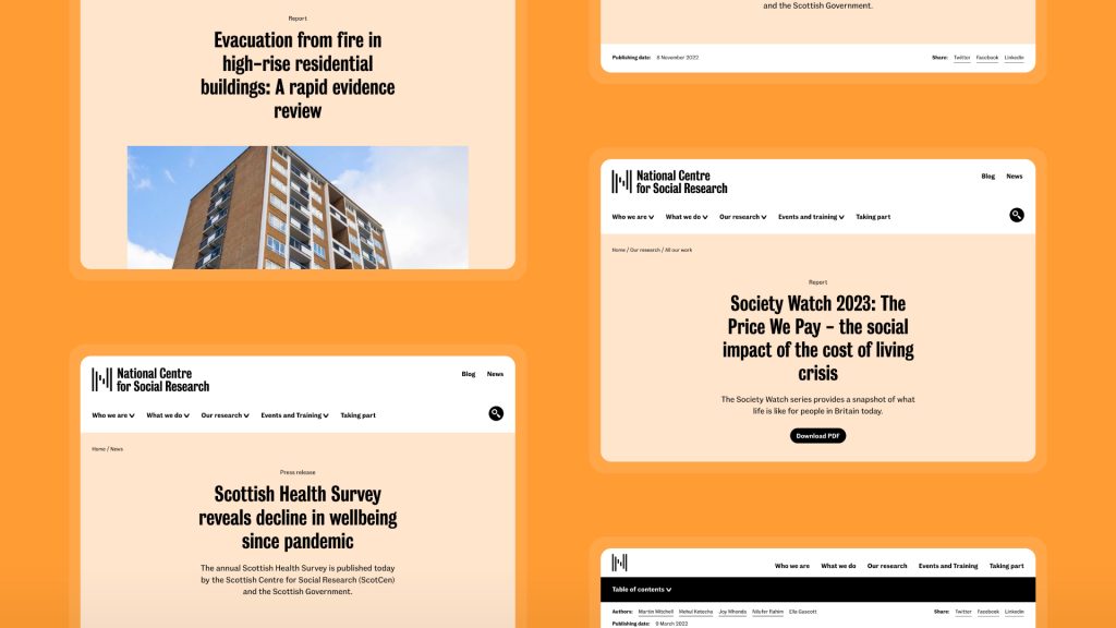
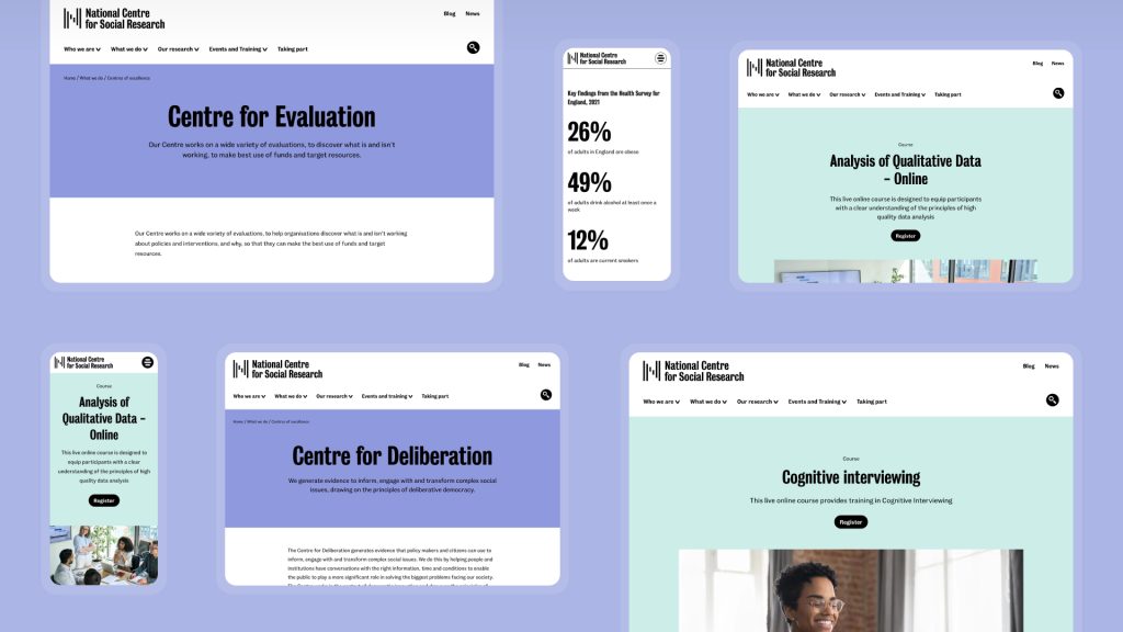
Through the website, we emphasised the new brand language’s typographic approach with high contrast in size and boldness. A selection of the brand colours is used across the different templates to add variety to the user experience and to reflect the identity’s range. Custom UI icons, influenced by the typography, inject brand personality on a micro level, and the redesigned site structure helps NatCen to better communicate who they are and what they do.

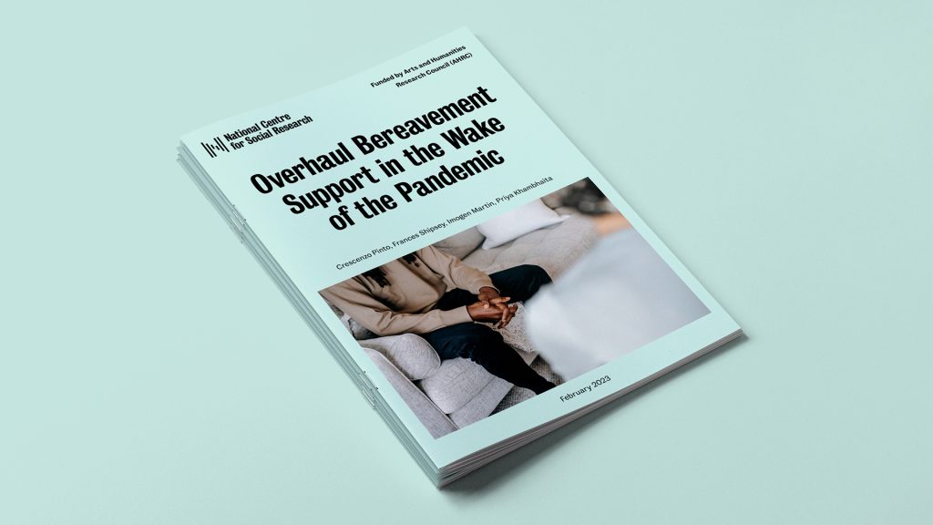
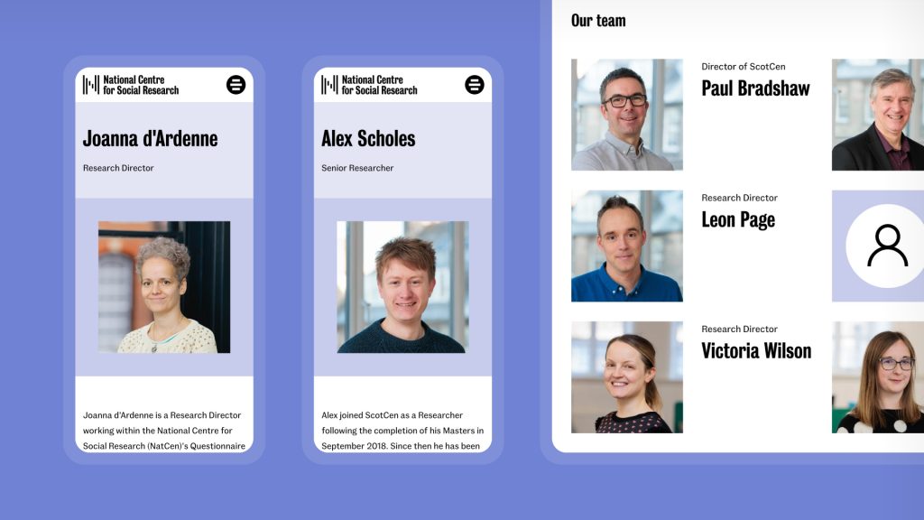
We also made recommendations on the photographic style of the brand, suggesting a more candid, reportage style of photography to depict a more accurate view of society. We worked with photographer Kit Oates to capture new shots of the NatCen team.
The website not only underwent a new look but a complete redesign of its functionality to improve access to our research for stakeholders. In just a few months after launch, we saw a massive uplift in our traffic and are seeing much more engagement across the variety of work we conduct.
Katie Crabb, Head of Marketing and Communications at the National Centre for Social Research
The result is an evolved brand that feels true to NatCen’s history, present and future, helping them to usher in a new era as Britain’s leading social research organisation.