Mike Connery was right: digital long-form for think tanks has taken off. And from the Brookings Institute to the King’s Fund, policy communicators are publishing fine examples of digital native think pieces and essays using bespoke models.
But not everyone wants (or can afford) a ‘Snow Fall builder’. If your organisation is not quite ready to invest in a scalable, custom-built plugin for your website’s content management system, then digital publishing platforms like Atavist and Shorthand offer an off-the-shelf option for publishing policy analysis, research and blogs that doesn’t require any coding.
The problem is knowing which one to go for. There are a tonne of platforms all offering apparently similar packages, so we’ve done some Which?-style product testing to help you choose the right one to fit your communications strategy, your budget and your content. We’ve targeted sites that expressly cater to long-form publishing and have considered a range of factors, including price, responsive design, multimedia features, and ease of use.
Remember, it’s possible to produce stunning results using these tools, but achieving this rests to a large extent on the quality of your content and the editorial decisions you make along the way. More about that in our next installment.
Atavist
4.5/5
In a nutshell: Storytime for grownups.
Cost: You can create unlimited projects on Atavist for free, but this version comes with many limitations: you can’t make customisations to the look and feel and you must use an Atavist domain name. Pay US$77/year to use your own branding and domain name, and US$1344/year to really make it your own.
Who uses it: The Century Foundation, Harvard University, Vice, the United Nations.
What it’s like: Atavist is incredibly easy to use. There are four themes to choose from, and stories are constructed from projects, sections and blocks using an interface that has a similar look and feel to Google docs. Aside from the blocks you’d expect, such as text, images, audio and other embeds, there are a wide range of features such as maps, galleries, charts and tables. Bonus points for elegant front-end design and for enabling parallax scrolling elements and interactive images such as before and after shots.
Social media: Share links are fixed on the right-hand side by default
Navigation: Choose between a sticky menu or a simple hamburger-style menu.
Responsive design: Fully responsive.
The rub: Without paying the minimum amount, you can’t customise how it looks at all, not even the colour of the buttons.
Shorthand
4/5
In a nutshell: Nice, if you’ve got the money…
Cost: A variety of plans starting from $1000 per story or $450/month for up to 25 stories, up to $12,000 for tailored packages.
Who uses it: BBC, The Guardian, The Telegraph, Save the Children.
What it’s like: If you’re looking for a simple but effective option, Shorthand is a strong contender. In the basic theme, there are only five different types of block to choose from, encompassing types of text, imagery and video content. If you pay, customising your projects using developer tools is fairly straightforward. You can use your own domain name, add your own CSS and Javascript, embed your own Google Analytics tracking code and feature multiple projects. You can also use ‘custom HTML’ blocks to add extra features such as interactive images, as long as you have at least a basic understanding of code.
Social media: Comprehensive and customisable settings.
Navigation: Could be better. You can add each section to a numbered sticky bar but this isn’t very easy for users to navigate.
Responsive design: Fully responsive.
The rub: You need to subscribe to a plan to publish anything at all. Being limited to 25 sections could be an issue if you have very long content.
Medium
3.5/5
In a nutshell: Doing one thing, and doing it well.
Cost: Free
Who uses it: The Brookings Institution, Barack Obama, journalists and policy wonks.
What it’s like: Lauded for its exemplary formatting and minimalist design, Medium offers a quick and easy way of getting your content online via your pre-existing social presence such as Google or Twitter. It’s a writing platform first and foremost, so it offers limited interactive functionality, but has the basics for images, video, other embedded media content. A neat touch is that users can comment on specific pieces of text publicly or privately, highlight text from your article or tweet a specific section.
Social media: Medium is sort of a social media platform in itself. If your content is of good quality and is tagged correctly, then it is discoverable by other users. All the normal share functions exist, but specific sections of text can be tweeted too.
Navigation: You can’t create in-page navigation between sections but your other articles will appear as related content, which enables you to build a visible body of work on the site.
Responsive design: Fully responsive.
The rub: It’s not possible to host your content on your own domain and you are limited to the (albeit nice) Medium styles. And watch out for an onslaught of daily digest emails when you sign up.
Squarespace
3.5/5
In a nutshell: Hey, good lookin’.
Cost: Publishing starts at $12/month. Unlimited pages and users is then $18/month
Who uses it: Nuffield Trust, Surface Magazine, various fashion and media sites.
What it’s like: Most Squarespace themes are very website-y, but there are a couple of themes that would fit into a more story-led one-page scroll site. Built on a block-by-block basis rather than a section-by-section basis, Squarespace is very easy to set up and configure. There are many customisations you can make, including linking to TypeKit to add your own font. On top of this, custom CSS can be added to make small alterations. It’s easy to transfer onto your domain and it’s also possible to connect to a subdomain.
Social media: Theme dependent, but various social media components can be dropped in. You can also create a ‘social links’ component, which will automatically populate with your connected accounts.
Navigation: Theme dependent.
Responsive design: Fully responsive.
The rub: Only a few Squarespace themes genuinely work for long-form content. Squarespace is also fond of emailing its users rather too regularly.
Storyform
2/5
In a nutshell: Could try harder.
Cost: You can publish one story per month for free, or a variety of plans starting from $8/month for unlimited stories and more options. Pay $99/month for your own domain hosted by Storyform (more to lose their branding).
Who uses it: Good question. It wasn’t easy to find any examples.
What it’s like: Despite some redeeming features, Storyform’s scrolling design inherently lends itself more to a presentation tool due to the section by section navigation and column-based text, so it does not suit long-form content. Because there are so many options available, it can seem a bit overwhelming, and the page builder isn’t reminiscent of how the page actually looks when you publish it. There is a WordPress plugin but it’s quite complicated to set up so a non-developer would probably struggle. If you pay, you can access full analytics.
Social media: Share links to Facebook, Twitter and Google+ are provided by default
Navigation: Offers section numbering but little else, apart from arrows and a progress bar.
Responsive design: Fully responsive.
The rub: Contrary to its claims, Storyform doesn’t particularly suit long-form content.
Pageflow
2/5
In a nutshell: Verwirrend!
Cost: Prices are unclear, but it seems to start at €19/month. Then it’s €49/month if you want your own branding and domain, more for various upgrades.
Who uses it: Sky, German news outlets such as Südwestrundfunk and Die Tageszeitung.
What it’s like: If you’re prepared to grapple with the decidedly awkward user interface (and the various pop-ups and tooltips that remain untranslated from German), then Pageflow can deliver good results. There is one default theme but loads of variations for each section and bags of customisable settings, for example the on the transitions between chapters and sections.
Social media: Share links to Facebook, Twitter and Google+ are provided by in a right hand sidebar, but they are hidden behind an icon which looks like it should be for ‘reply’.
Navigation: There is a right-hand sidebar that shows all of the sections (kind of like when you’re viewing a PDF in Acrobat), although the default one is rather ugly. There are also scroll-down prompts on the bottom of each section.
Responsive design: Fully responsive.
The rub: A pain to use.
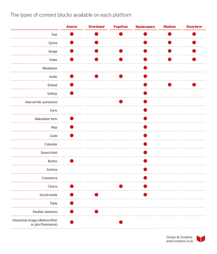
Summary of type of content blocks available on each platform
The table below provides a summary of the content blocks that each platform offers. Choose wisely.