At Soapbox we are passionate about working creatively with our clients to bring about progress towards a more peaceful, prosperous, fair and sustainable world.
In order to achieve that impact, our clients’ ideas and research need to reach a wide range of audiences as well as the right audiences. They can’t do this without a brand which speaks to all of these audiences and a website where different users can engage with their content at different levels.
Over the last two and a half years we have worked with the Stockholm Environment Institute (SEI) to modernise their communications as they seek to reach an increasingly diverse, global and digitally-focussed audience. A major milestone was reached this week with the launch of the new SEI brand and website.
In this long read, the first in a series of two, I will discuss how Soapbox and SEI worked together to rebrand the organisation. Next time I will look at the process used to build their new website.

The importance of think tank branding
Modern think tanks look at their brand as more than just a logo and the surrounding visual identity. Your brand is the expression of who you are as an organisation and what people can expect of you.
Wally Olins, the father of modern branding, said: “a brand is about promises fulfilled”. For think tanks, these promises are expressed not just in the visual identity, but in the way you talk, write and behave, the kind of research and communications products you create and the channels you use to disseminate them.
Modern think tanks have brands which:
- Help them become the organisations they aspire to be. Their brand strategy is an extension of their organisational strategy and shows how communications and behaviours can turn their corporate vision into a reality.
- Help them own a piece of intellectual and cultural territory. The best think tanks know exactly who and what they are for. They own, convene and (at their most successful) legitimise debates around the issues in which they are active.
- Help them produce the right kinds of communications for the right audiences. Building the brand starts with a sound understanding of the client’s audiences. A good brand identity and strategy is a toolkit to make communication with these audiences efficient and impactful.
We set out to achieve these goals for SEI, through a four stage process.
Stage one: discovery
We started working with SEI on discovery before the organisation had even decided to change its visual identity. They wanted to understand their audiences better and hired us to help them think about how to engage users through digital communications and a restructured communications team.
This involved a number of interviews across different audiences to discover what stakeholders already thought about SEI and what they wanted from them. We developed audience personas to map user journeys from the first encounter with SEI through various online and offline touch points to see if SEI was fulfilling what was expected of it.
It quickly became clear that the existing visual identity was not fit for purpose for SEI’s digital ambitions. Nor was it aligned with the organisation’s ambitious global strategy. Most especially, it did not represent the values and personality of the people we encountered working at and with SEI, and it wasn’t helping the organisation communicate the depth and value of its activities. After this initial work, SEI took the decision to revamp their visual identity.
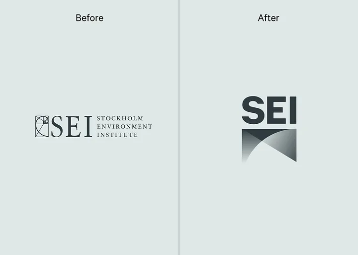
It is important for organisations undertaking rebrands and significant digital projects to have strong internal champions to drive the project forward. SEI gained this when they appointed Moa Engström as their new Head of Digital (and later Head of Corporate Communications). Moa worked alongside her colleague Tom Gill to drive the branding process forward, wrangling a large complex global organisation into line and acting as a critical friend to Soapbox, making our creative work better and forcing us to justify our decisions.
To underpin SEI’s new visual identity, we undertook further discovery work including:
- A staff workshop focussing on organisational values and personality;
- Senior staff interviews focussing on organisational strategy and history;
- A competitor analysis looking at other environmental and development think tanks and focussing on SEI’s unique positioning;
- A brand audit focussing on how the brand is used currently and how staff and users would like to use it in the future.
Stage two: thinking
Our research was compiled into two key documents (a creative brief and a short brand strategy) during the thinking phase.
A creative brief should bridge the gap between what has been learned and what this might mean in visual terms, and so an understanding of the visual history of an organisation is important. In this case, SEI had previously used a fibonacci spiral in their visual identity as a way of representing the link between science and the natural world in their work. It was important for SEI to see visual routes which incorporated this concept and provided continuity with their historical identity.
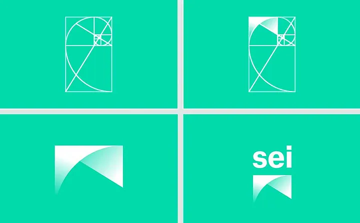
Descriptions of the organisation’s personality and values are also crucial. We had been struck by the ways in which SEI’s fiercely independent, practical and fundamentally honest personality was not reflected in the brand identity.
Crucially, the strategy emphasises SEI’s role as a bridge between science and policy and the global nature of the institute — SEI has centres in Asia, Africa, North and South America, as well as the UK and Sweden. This clearly differentiated the institute from other development and environmental research bodies in a way which came across strongly with everyone we talked to about SEI.
Stage three: Creating
We began the creative stage of the branding process by designing three distinct visual routes to express the values and positioning determined in the earlier stages. These routes included a logo and colour choices, typographic treatments, inspiration boards and example applications of the brand identity.
The process is best explained visually. Here are pages from the three initial routes:
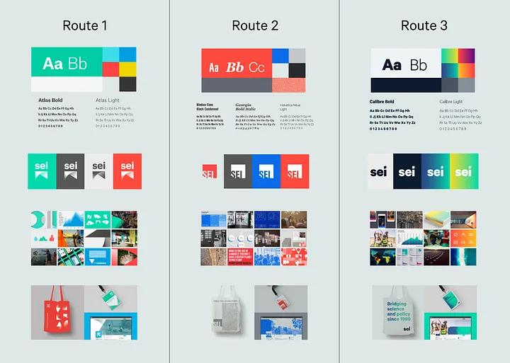
These were reduced to two routes (routes 1 and 3) and refined with feedback from the communications team. The two routes were then presented to the executive team and heads of the global centres for further feedback and a video presentation was prepared so that the routes could be shared with the wider organisation.
The decision was made to proceed with the route 1 and there was a discussion about whether the letters in the logo should be upper case, lower case or sentence case. Different options were presented and a final round of feedback resulted in the finished brand and a logo which draws on SEI’s visual history while acknowledging their purpose as a bridge between science and policy.
Stage four: doing
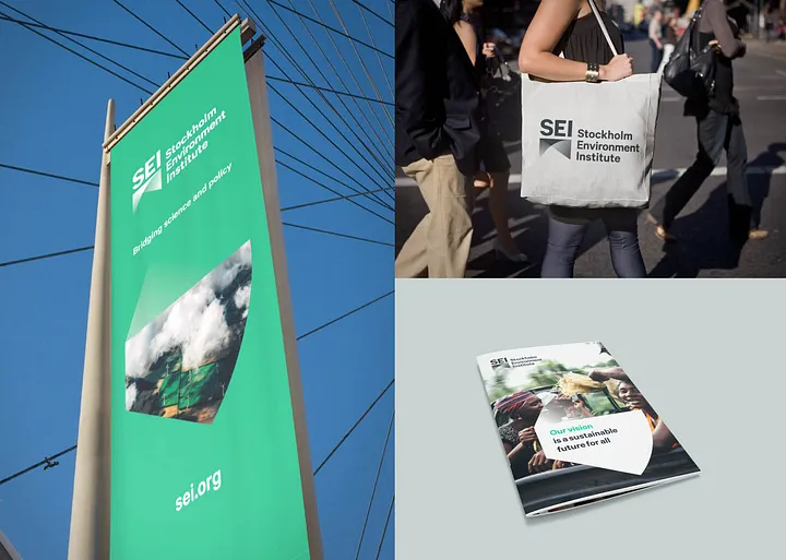
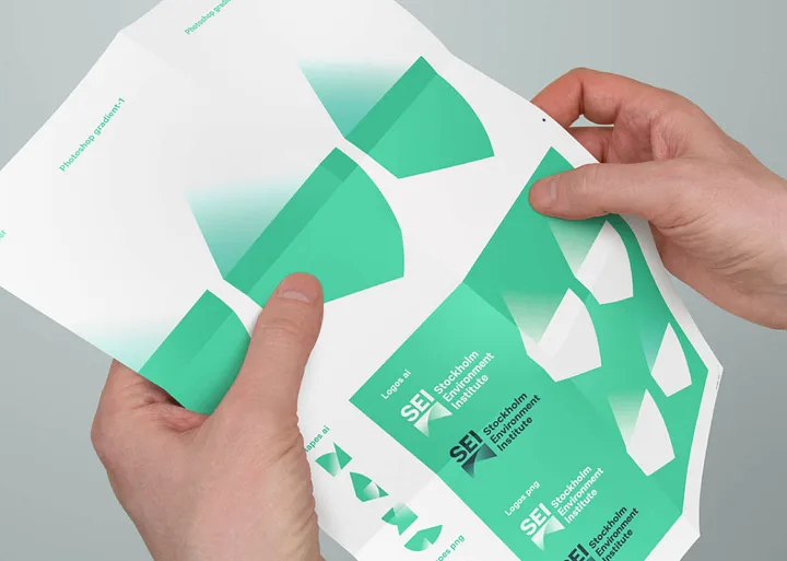
With the final creative route signed off, we began to turn the new identity into a practical set of guidelines and templates that will allow SEI to present itself consistently with efficiency and clarity.
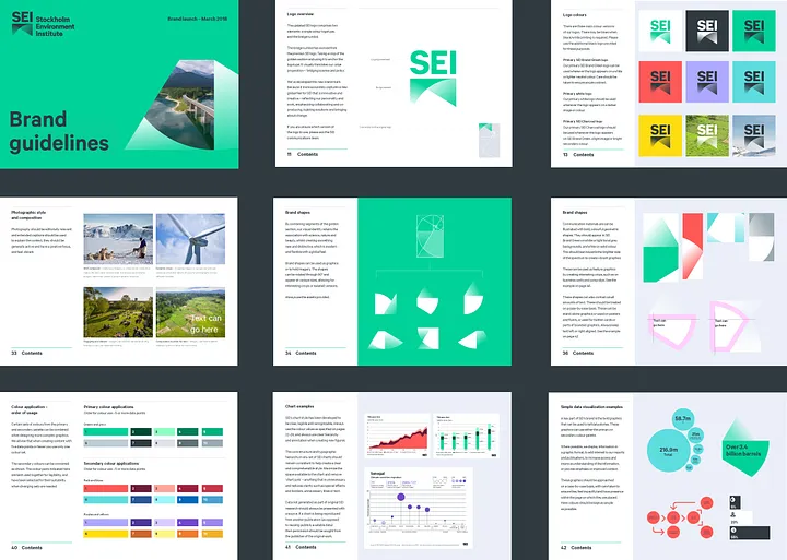
We worked to refine the colour palette to ensure accessibility for people with visual impairments as well as maximising colour consistency across digital and print applications.
The SEI brand has been designed with a digital-first methodology because we expect the primary way that users will experience the brand is online. That meant selecting a font specifically designed for digital use as the primary typeface — we chose Calibre by Klim Type Foundry.
For a data heavy organisation like SEI it is important to think about how colour, labelling and icons all work together in graphs and infographics — we call this an information system.
Finally, we created further “brand shapes” derived from the fibonacci spiral — these can be used in flexible ways across branded applications and work especially well when combined with SEI’s new style of human-centred photography.

Next steps
We signed off the final SEI brand world almost a year ago, but the Institute made the decision that the new website should be the first and best expression of the new brand and set a strong benchmark — a decision we completely endorsed.
This has given the team the chance to build up excitement for the launch, internally answer any questions, iron out any problems and make sure everything is in place.
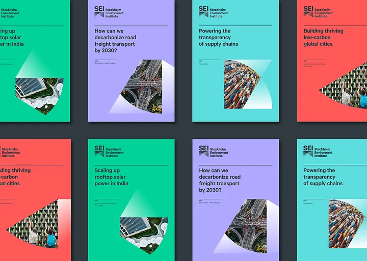
And it has given us the opportunity to spend time making sure the guidelines are correct. We enhanced SEI’s publication templates, creating a stunning annual report to be published in April, and produced signage, banners and other brand assets along with a launch campaign which you can currently find unfolding across social media.
Think tanks have too often allowed their brand identities to become stale after an initial rush of enthusiasm. The SEI communications team are determined to take think tank branding to the next level with active brand management — a practise which is commonplace in the corporate sector. As Moa Engström says: We are excited to keep working with Soapbox and other partners as our brand is extended to new channels and meets new challenges. We will be monitoring its effectiveness with a critical eye — adapting, tweaking and amending to ensure the brand assets continue help SEI bridge science and policy with maximum impact. Originally published at On Think Tanks on March 27, 2018.