Accessibility is everyone’s responsibility. Around 1 in 4 people in the UK and the US have some type of disability and around 1 in 6 people worldwide experience significant disability.
At Soapbox, we understand the importance of creating content, journeys and experiences that are accessible for as many people as possible. That’s why we always build our digital products from the outset with an understanding of accessibility requirements, how to implement them and how to test them effectively.
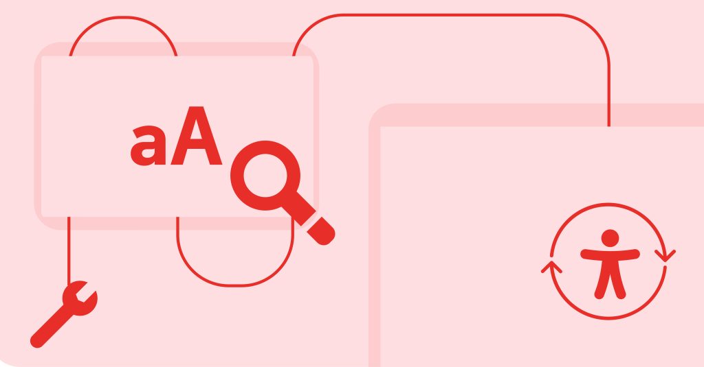
Exactly what accessibility is can seem a bit mysterious – it’s a wide-reaching term and covers many things. We can make it more relatable by thinking of real world scenarios.
- We add alternative text to images so that users using a screen reader can interpret the image-based content.
- We build clear mobile interfaces with larger tappable areas so that a new parent holding their child can easily navigate around with one hand.
- Using typefaces and type styles that are clear so users with dyslexia can comfortably read the content.
Everyone has different abilities and limitations, it’s up to us as content creators and website builders to accommodate these to the best of our ability.
In order to achieve an accessible product, we follow the Web Content Accessibility Guidelines (WCAG). These guidelines are split into four key principles, with each guideline having a conformance level of either A (basic accessibility), AA (strong accessibility) or AAA (excellent accessibility). Our websites are built to AA standards by default, but we can exceed them when a client requires it.
Looking at the guidelines, there are some clear goals that are part of our build and test process. Here are just some examples of the criteria (as numbered) and the action undertaken.
How the Soapbox team meets our website accessibility criteria
From a development perspective:
2.1.1: All functionality of the content is operable through a keyboard interface (Level A)
This is a basic accessibility requirement, that the whole site can be accessed using a keyboard. Each component we build is individually tested to make sure that each interactive part is navigable and that it is visibly focused.
1.4.10: Reflow (Level AA)
The reflow criterion essentially ensures that the website build is responsive and that scrollbars aren’t introduced unnecessarily. All of our websites are fully responsive, from 320px wide (the smallest device size) all the way up to large desktop screens. By thorough testing of different device sizes and zoom levels, we’re able to make sure that all content is visible and navigable for everyone.
From a design perspective:
1.4.1: Use of colour (Level A)
Distinguishing between colours can be difficult for many users, so ensuring that any colours used have a sufficient contrast ratio and that colours alone are not used to convey information is a key consideration. It’s important for us to get a balance between brand aesthetics and having an accessible colour palette.
1.4.12: Text spacing (Level AA)
Users can set their browsers up to suit their needs, including having a larger size text or using the zoom functionality. We set up and design our text styles to be comfortable to read at a range of different sizes, taking into consideration typographical elements such as line spacing, font size and line length.
From a website administrator perspective:
1.1.1: Non-text content (Level A)
Assistive technology, as well as search engine crawlers, need to be provided with alternative text for images so visual content is understandable for everyone. The alternative text should be descriptive, short and specific to ensure it’s serving its intended purpose. There are plenty of resources available to assist with writing effective alternative text, and it’s also a space where AI is beginning to make strides in image interpretation (although that is not without its flaws).
2.4.6: Headings and labels (Level AA)
Well-written and well-structured content is the backbone of any website. This includes making sure that content is headed appropriately and broken down where necessary. But it’s also important to note that most users simply scan web pages rather than read them word by word. We always provide a customised editing experience that gives website administrators the ability to produce well organised and beautifully formatted content. Clear, descriptive headings add clarity for users of all abilities.
In conclusion
A large set of guidelines such as WCAG can seem daunting, but once we ingrain accessible thinking into our decision making process, many of the success criteria take care of themselves. It can be as simple as website editors considering whether ‘More’ is appropriate, sufficiently descriptive text for a link. Or it can be more complex, such as designing and building spaces for video or audio transcripts to be added. Here’s an example of this in practice in the site we built with IFS. Accessible thinking is the first step towards accessible websites.
If you’d like to find out more about how you can build accessibility into your website, we’d love to help. Get in touch at hello@designbysoapbox.com.