We brought the Alliance for Health Policy and Systems Research up-to-date with a visual identity that better reflected its innovative spirit and pioneering approach.

For over two decades, the Alliance for Health Policy and Systems Research (AHPSR) – an international partnership hosted by the World Health Organisation – has worked to improve the health of those in low- and middle-income countries through supporting the generation and use of evidence that strengthens health systems.
Since its beginning, AHPSR has been a pioneer in the field of health policy and systems research. But its visual identity had struggled to keep pace. It didn’t reflect the true spirit of the organisation, and wasn’t expansive enough to work across an ever-increasing number of touchpoints.
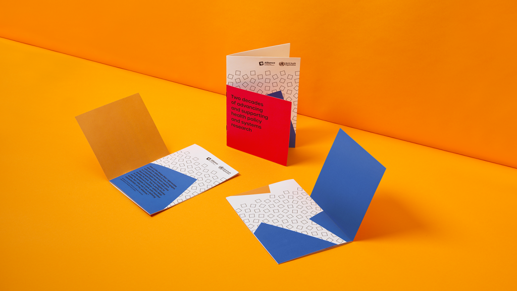
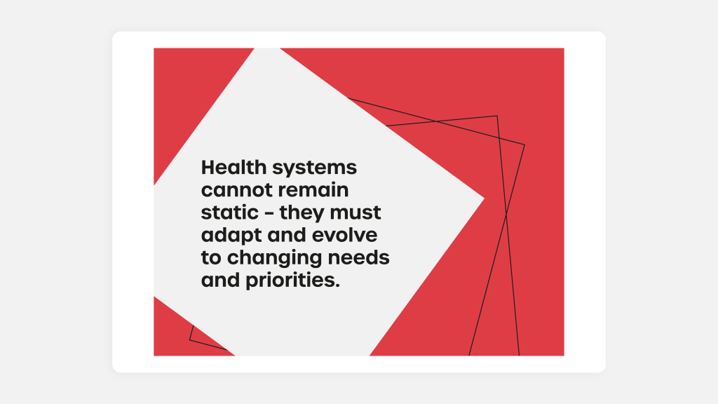
The Alliance’s long-established logo was to remain a staple of the refreshed identity. But we needed to build a cohesive visual system around it. Taking the icon as inspiration, we built out a new visual identity centred around a set of block shapes. These blocks exist as a mesmerising set of geometric patterns that constantly shift in unexpected ways, serving as a visual metaphor for the ever-evolving nature of health systems.

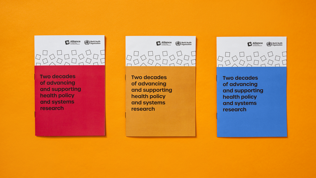
The brand palette revolves around three core colours – Alliance Blue, Alliance Red and Alliance Yellow – used in combination with black and white. This simple but bold combination sits in contrast to the more complicated patterns and helps ensure the shapes remain the focal point of the visual language.
Classic and authoritative, we chose Urbane as the primary typeface. We cleaned up and evolved the wordmark, playing around with the proportions to shift the emphasis onto the ‘Alliance’ element of the name.
A simple set of illustrative and functional icons have been developed to reinforce meaning and add visual interest across AHPSR’s array of outputs. Blocky, minimal and linear, the iconography follows the style of the geometric shapes that dominate the visual identity.

With the identity finalised, we developed a series of functional templates for the brand and codified the system into a short set of guidelines. These tools help ensure APHSR can apply its new brand expression consistently and confidently as they grow and evolve.