Heritage gives us a sense of place and a sense of self. It’s fundamentally about what it means to be human. For an organisation like ICCROM, it’s their responsibility to protect that.
ICCROM is an intergovernmental organisation with a unique mandate – to promote the conservation of all types of heritage for people everywhere. They provide their Member States with world-class tools, knowledge and skills to tap into heritage’s potential to shape a better future.
The only institution of its kind, ICCROM was created in 1956 in response to the urgent need to reconstruct cultural property in the aftermath of the Second World War. The world may have changed a lot since then, but their original mandate remains as important today as it was then.
From the outset, they walked us through every step of our brand transformation journey. Their confidence, insights and dedication reassured us that our project was in capable hands.
Camilla Ravetto, Communications Officer at ICCROM
Following a detailed consultation process, ICCROM approached us in search of a refreshed identity that would improve visibility, maintain credibility and modernise the entire organisation’s look and feel.
We began the process with an in-depth discovery phase. We travelled to Rome for two days of intensive engagement with the ICCROM team, and immersed ourselves in their incredible building and history.
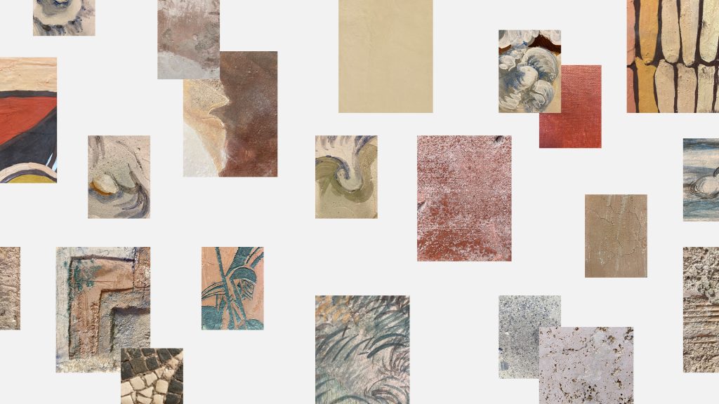
One word that stood out for us when it came to ICCROM was tactility; from the historical workshop materials that adorn the walls of the office to the traces of human involvement found in heritage sites. We knew almost immediately that this had to make its way into the identity in some form. At the same time, it was about finding the right way to bring ICCROM’s history into the future of the organisation.
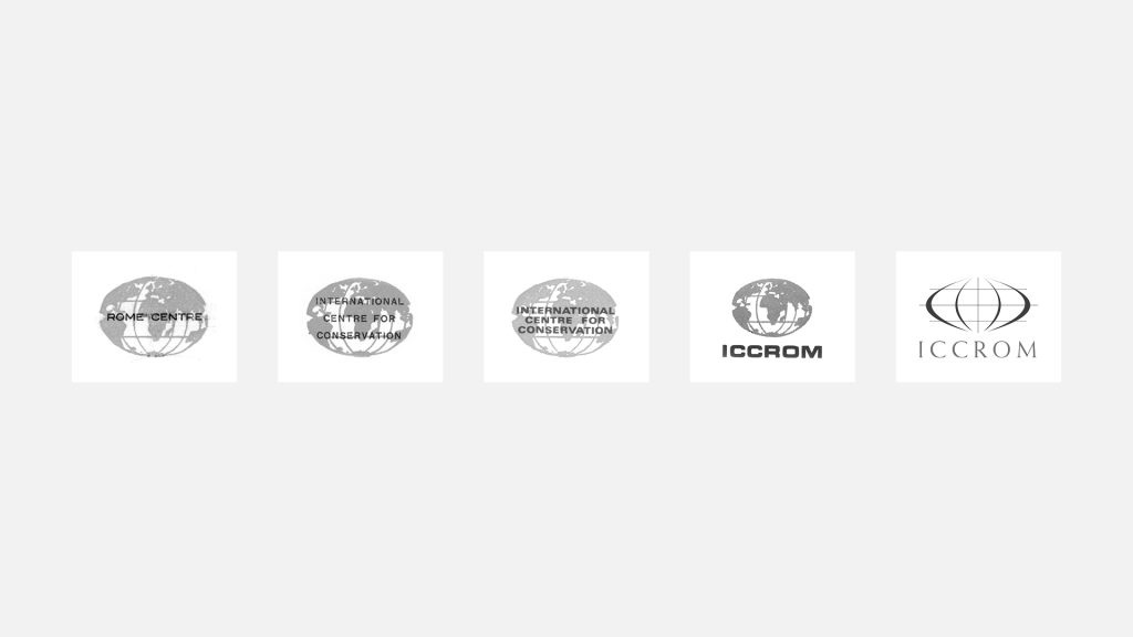
Since its inception, ICCROM’s logo has contained a globe of some kind as a way to convey its reach and on-the-ground impact. Questioning the effectiveness of this as a visual representation – while looking for a sense of continuity to the historic logos – we went in search of a new way to reflect ICCROM’s spirit of international collaboration.
The resulting symbol is inspired by a location pin – a mark that is synonymous with place. Equally sized pins reflect the equally valuable contributions of ICCROM’s Member States, with all pins coming together to form a whole without boundaries or borders.
ICCROM is an international organisation with a global audience. This meant it was vital to have a flexible identity: cohesive, but also creating the space for different programmes and regions to present themselves in ways that they felt best. We rationalised the brand architecture but built a high level of expression into the wider system to allow room for individuality.
Expression is also at the forefront of the brand typography, with the beautifully characterful forms of Bricolage Grotesque leading the way as the primary typeface, supported by Lora for body copy.
We consulted with ICCROM’s colleagues at their Regional Centre in Sharjah on the best choice for an Arabic typeface – one that strikes the right balance of personality and legibility – landing on Tajawal as the primary with Noto Sans supporting.


The brand colour palette is a celebration of the organisation’s history, and a taste of things to come – a vibrant blue takes the place of a deep navy (the previous lead brand colour), a warm red references the 1970s logo, and a broad palette is inspired by the colours used throughout ICCROM’s activities over the years.
Optimistic and vibrant, it captures the energy of the global network and the variety of the work ICCROM undertakes, but it is also built with a focus on practicality – ensuring that a wide range of possible combinations comfortably meet accessibility contrast requirements.
After exploring different ways of bringing tactility into the identity, we landed on using actual textures and marks from the office walls and sites, but treating them with the brand colours as a way to inject warmth, vibrance and variety – giving these historic materials a new lease of life.
The combination of textures and colours is the foundation of the brand system – an endless array of intriguing combinations that provides the flexibility for ICCROM to appear as it sees fit for different contexts and audiences. This flexibility continues all the way through to an individual level, where the team can choose (or create) their own combinations for items like business cards or security passes.

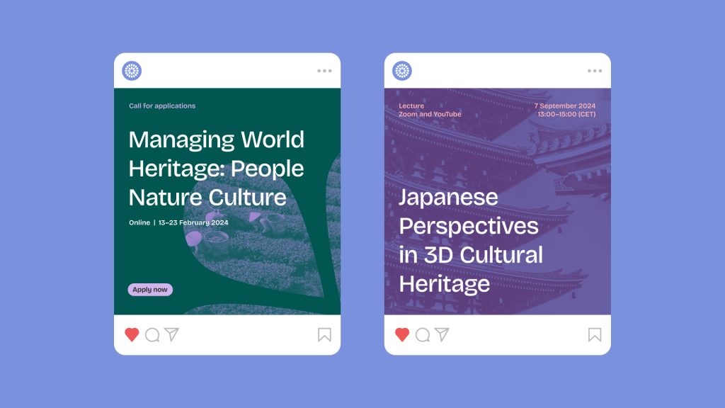
Alongside a comprehensive brand guide, asset and template pack, we also worked closely with ICCROM to create a suite of activation items for the brand launch and beyond. We created a brand presentation that the team could use to unveil the identity internally and to Member States; a mini ‘brand book’, that weaves the strategic vision through core visual elements and their reasoning; and bags, banners and brochures that provide the tools to effectively ‘brand’ talks and events.
With a unified identity in place and a team eager to take it forward, ICCROM now has a true picture of who they are as a brand – one ICCROM for all to stand behind.


We have emerged with a revitalized brand identity that resonates with all of us, filling us with pride and a renewed sense of purpose.
Camilla Ravetto, Communications Officer at ICCROM